Writing - Design - Redesign Portfolio

I am an experienced technical writer and document designer. For examples of some of my work, click these links.

Writing and Design - Data Center Installation Guides

Overview
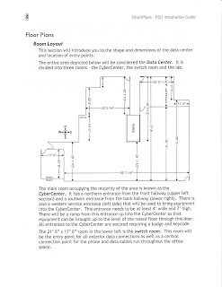
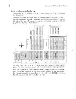
These pages are from a series of documents I designed and wrote during construction of a data center. Specifications for power and data lines, cooling units, rack locations, and floor tiles had to be exact and clearly documented in both text and diagrams for the construction teams.




Writing - Department Overview

Overview
For the company intranet, each department was asked to write a summary of their teams and each team’s responsibilities.  After one of my team members wrote the first draft of our department’s description (top), I edited it (bottom) to make it more polished, reader-friendly, and concise. 


Writing - Member Showcase Article

Overview
As part of the monthly newsletter, I write these articles to showcase our member businesses.   
I interview the business owner, review any promotional or other materials they share with me, and research their area of expertise for additional information. 


Design - Event Flyers

Overview

Flyers are the main communication about and invitation to chamber of commerce events.  These pieces need to relay the detailed information about events, as well as look inviting and be unified with the theme of the event.  


For the Hog Fest event (a motorcycle-themed pig roast), I first designed the Hog Fest logo with the pig, flames, and motorcycle wheel.  Then I designed the flyer, tickets, and signage for the event with the logo as the main graphic. 


Other designs like the Business After Hours flyer are usually stand-alone pieces.   

Redesign - Newsletter

Original
This original newsletter was mailed to me.  The basic layout needed some adjustments to make it more engaging.


Redesign
My redesign keeps the original newsletter’s three-column layout but optimizes the white space for a more open feel.  First, I reduced the gutter between the columns.  Then, I redesigned the nameplate to bring the text closer together and to allow more space between the text and the border.  To reinforce the basket theme, I added basket graphics and used woven rules on the page.  For the sidebar, I used a wavy rather than straight box to break up the potential monotony of a three-column design.  I also used a drop shadow to add some dimension.


Redesign - Order Form

Original
This flyer for homemade cookies was posted on a bulletin board, but didn't draw much attention with it's small font and graphic.


Redesign
My redesign adds some cooking-related graphics as visual clues about the flyer’s content and to create a fun, homemade feeling. I used a large, playful font for the heading to make it easier to read from a distance and to fit with the other rounded elements. Finally, I organized the text into shorter lines and made the cookie names more prominent.


Extra
This invoice, created in Excel, could be given to customers, as both a record of their purchases and a price list for future purchases.

Redesign - Postcard

Original
This original postcard was mailed to my home.  The extra space given to and around the graphics limited the amount of space available for the accompanying text.  

Redesign
My redesign gives this postcard a unified look by minimizing the white space around the graphics, using it around the text instead. I split the fish graphics, arranged them in different locations and bled them off the page, added graphics of other elements that would be found in an aquarium, and removed the rules around the address area. These changes allowed me to keep the text in the center of the card and organize it into sections without boxing in small bits of text with the graphics.


Redesign - Newspaper Ad

Original 
The ad below ran in the local paper.  My redesign below streamlines both the writing and the design.


Redesign
I rearranged the graphics and text for a more orderly and unified appearance.  Next, I tightened the writing by removing many of the unnecessary prepositional phrases and rewording the remaining text to emphasize the important content.  Finally, I highlighted the main point of each tip so the reader can quickly review the suggested tips.